Gifting with
Purpose
Purpose
— ROLE
Product and Website Designer (UX/UI)
— SKILLS
Prototyping
UI Design
Website enhancement
— DATE
05/2021
Two Good began ten years ago as an ad-hoc Kings Cross cook-out for the area’s less fortunate. Since Two Good launched, they have dedicated themselves to doing everything to restore a sense of self-worth in women seeking refuge from domestic violence. In June 2015, they launched their ‘Eat one, Treat one’ model; for every meal purchased, they give an identical meal to a woman in need. As of 2017, they have served over 163,989 meals to women in refuges across Sydney and Melbourne.
the brief
This brief focused on designing a high fidelity prototype for two major enhancements of the Two Good website:
1. Design the key features of a gifting platform that provides functionality for customers to use Two Good products as gift purchases for friends and family.
2. Design a journey on the website that represents the full story cycle of the gifting process; from purchase to fulfilment of the TwoGood promise, ‘Eat One, Treat One’.
The need for these enhancements was born out of pre-existing research that uncovered how the Two Good platform was used by customers; namely, as a gifting option for others. The double effect of supporting women in need as well as providing a fulfilling experience for the gift purchaser and receiver was the major contributor towards product sales. Two Good wanted to more clearly express the stories behind the impact of customers’ gifts on another person’s life.
project
overview
As the company had already undergone a background process of UX research into its customer base and how they interact with the website, this project was focussed on a refresh of the UI based on the aforementioned enhancement needs. After an initial stakeholder interview followed by a ‘How Might We’ brainstorming session, we set out sketching wireframes, constructing low-fidelity mockups, and iterating based on user testing feedback. Creating a Design Kit was also important for developer handoff and brand consistency.
ideation
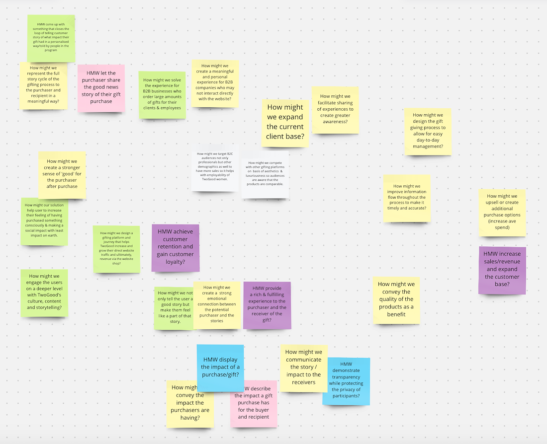
‘How Might We’ brainstorm
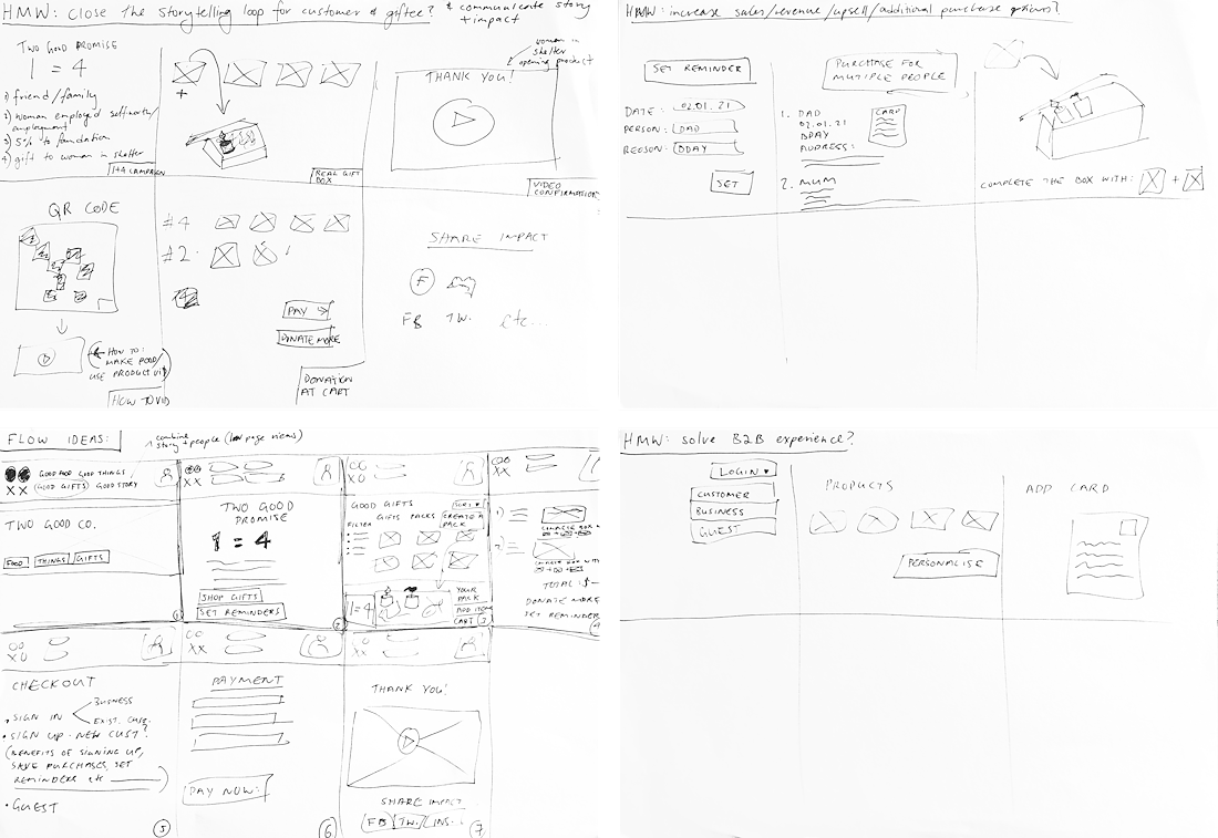
Initial Wireframe Sketches
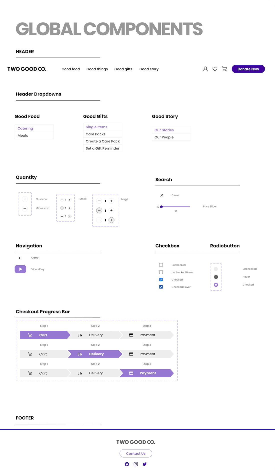
Design Kit
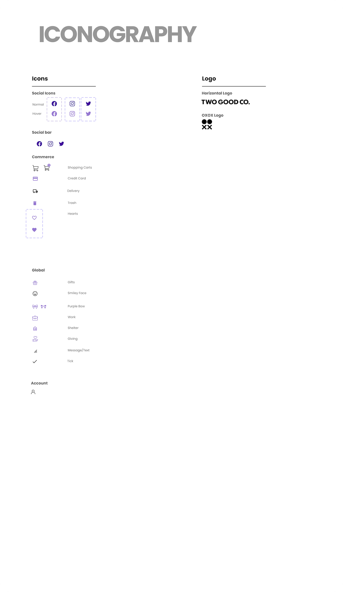
Design Kit
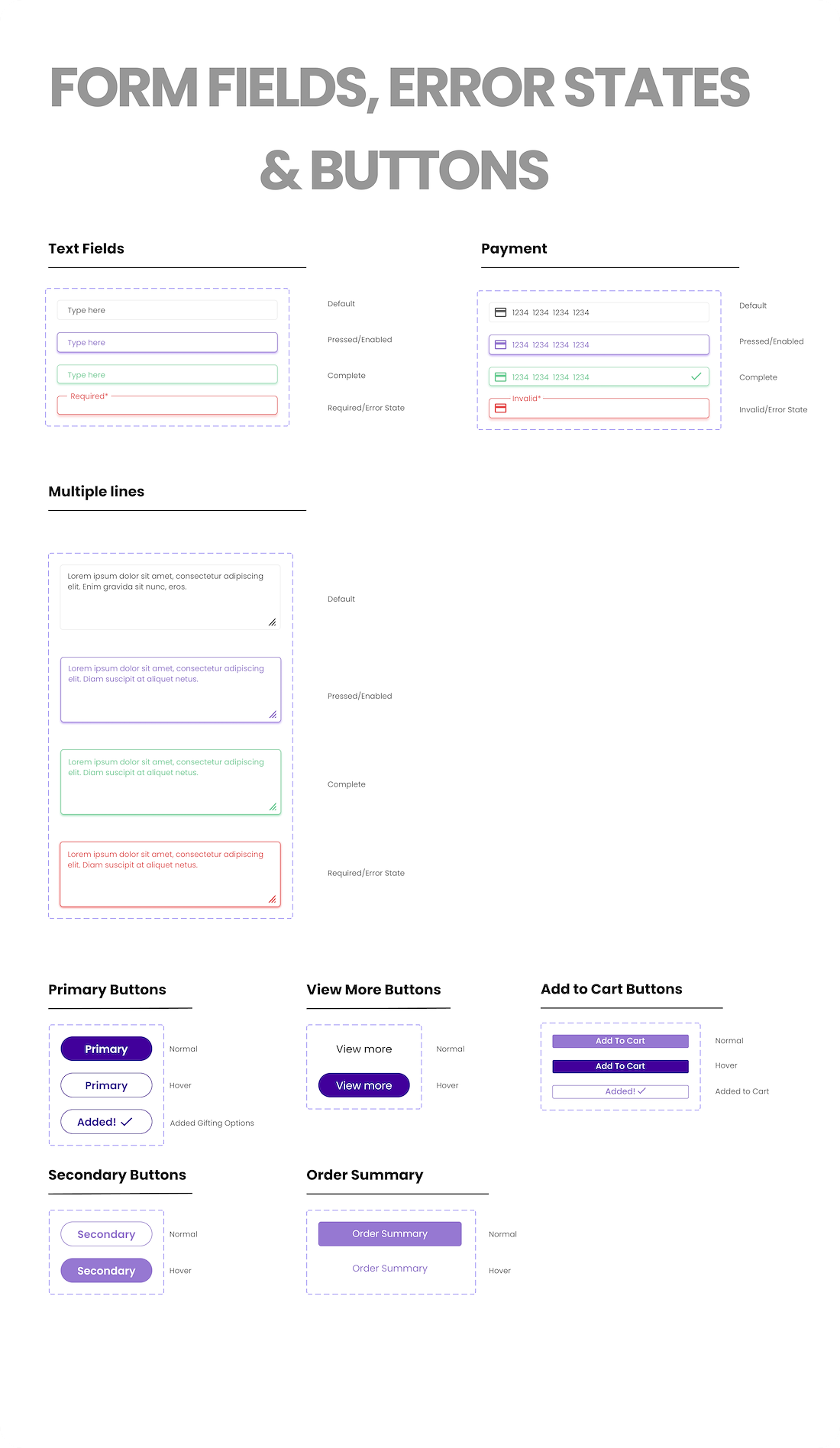
Design Kit
Low Fidelity Wireframe of Landing Page
Low Fidelity Wireframe of Cart Page
Low Fidelity Wireframe of Shopping Page
Low Fidelity Wireframe of Purchase Page
testing
The name of the game is iteration, and no iteration is complete with taking the product for a test run. After an initial round of user testing the low-fidelity mockups, two main ideas became apparent. Firstly, more personalisation of the product was necessary. This meant really driving home the impact that Two Good has, and the impact a customer can make by purchasing a product. Storytelling was key here. Secondly, more clarity was needed in the website navigation and in the gifting process. The existing navigation was cumbersome and confusing.
insights
- When users purchase gifts, the fact that a gift has a social impact is a huge plus – people like to give “meaningful gifts”
- There is a mixture of gift purchasing on both computer/desktop and mobile, contrary to what currently occurs on the Two Good website
- People were unclear about what the Purple Bow Moments were – this was a missed opportunity for storytelling
- People are hesitant to sign up unless there are clear benefits as to why – most of the benefits (saving credit card details, saving addresses etc) are already built into browsers such as Chrome, so unless there are other advantages, signing up doesn’t appeal.
- Confusion regarding cart and delivery procedures – more clarity needed here.
- People like the personalisation of the gifting options, they thought this was a nice touch they hadn’t seen before.
- For people who hadn’t visited a website before, they spend most of their time on the homepage trying to figure out what the company is about.
- Visuals are always easier and better than text.
- Storytelling needs to be more evident as it currently looked just like a standard ecommerce site with options to gift but the social impact wasn’t evident enough
back to the drawing board! iteration, iteration, iteration
Iterative Wireframe Sketches
The idea of a ‘purple bow moment,’ a phrase utilised internally at Two Good to indicate a significantly impactful act, was added to certain products to showcase the ‘Eat One, Treat One’ model – that for every one of these products purchased, another gets donated.
Additionally, as a means of enhancing the storytelling and maximising the impact, an ‘impact tracker’ was added to the Success Page to show that each purchased item multiplied the social impact by four times.
It was important to showcase the women that are directly impacted by Two Good’s work as a way to further personalise the gifting journey. I added a bank of personal stories of said women to the website and featured one on rotation on the homepage.
Site navigation was a real point of confusion. To this end, I separated products into three distinct categories; food (for catering), things (for general products), gifts (for specific gifting purposes).
Lastly, to further drive home the gifting functionality and aid in clarity, a ‘make your own gift basket’ function was added so that customers could see a visual representation of what they were gifting both to their friends/family, and to a woman in need.
final design prototype
what next?
Storytelling and navigational clarity need to always be front and centre going forward as these two ‘Two Goods’ will create the best experience for the customers in the longterm. Users loved the ‘Set Gift Reminder’ function, however due to time constraints I was not able to fully develop this. This would have incentivised customers to come back and buy gifts through Two Good multiple times a year; a low-effort win that could ensure customer retention. This design solution was created for desktop as that was how most users in my testing said they would usually buy gifts, however that means that a scaleable version needs to be designed for mobile uses.


