Building
Connections
That Matter
Connections
That Matter
— ROLE
Product and Website Designer (UX/UI)
— SKILLS
UX Research
Wireframing
Prototyping
UI Design
— DATE
10/2020
Cotton On’s social enterprise, ‘The Cotton On Foundation’, partners with communities around the world to support health, wellbeing, and education programs in said communities. Twelve years ago, they began an internal sponsorship program, allowing their employees (and family and friends) to sponsor children in these communities in the form of a tax-deductible contribution from their salary.
the brief
To research the needs and wants of sponsors, and design a platform for them to support their sponsored child/ren.
The goal of the platform was to drive strong engagement and boost the participation rate for sponsors with their sponsored child. The must-haves for the platform were:
- A way for sponsors to manage their own details
- A way for sponsors to view their sponsored child, including photos over time
- Functionality to send messages to a child and / or videos
project
overview
The target audience for this project was the Cotton On Group team members who were enrolled in the child sponsorship program. Our primary tasks were twofold:
1. Research and understand the user behaviours and needs of the sponsors in relation to the sponsor platform and child sponsorship program.
2. Design a solution that focuses on 1-2 of the must- have functional areas.
Through initial conversations and interviews with the Project Engagement Coordinator of the Cotton On Foundation, we began to get a better understanding of the brief, its scope, and the inherent business problems we needed to overcome. We engaged in card sorting exercises, 'How Might We' brainstorming, and thematic analysis in order to narrow the problems down to their bare essentials, and as a basis to better guide our future user interviews.
From here, we moved onto user interviews to gain a solid understanding of: what our users were going through, how they currently interacted with their sponsored children, their pain points, and their desires for a potential sponsorship portal. Similarly, we engaged in card sorting exercises to help narrow down and define the user’s problems.
From here, we were able to piece together the recurring themes and ideas in order to define the main business problems, customer problems, and ultimately the UX opportunity that lies in between.
We created personas and customer journey maps to help further empathise with our users and define how they interact with the sponsorship program in its current form, and what they would like to see for it in the future. The main takeaways from these personas were that sponsors really wanted to help and engage with their sponsored children, however they were left feeling confused about how they could do so. From a business perspective, too much time was spent on manual administration regarding data collection, sponsor engagement, management, and retention.
user insights
The insights we gained from our interviews were invaluable to our design thinking around this process. At the heart of the problem lay the confusion of the sponsors as they were unsure of where their money was going, how it was helping their sponsored child/ren, and how their sponsored child/ren were actually progressing.
Inconsistency and lack of communication + no central sponsorship platform = sponsor confusion and disengagement
“[it] Isn’t consistent and isn't necessarily the experience that we would want.”
“I haven't heard anything about the program since. So, um, and that was maybe two years ago.”
“I feel engaged in the sense that
money comes out of my account every fortnight, and and I feel like I'm doing my bit, but I don't feel engaged with the individuals that I sponsor.”
ideation
We began a process of ideation, first with creating a series of ‘How Might We’ questions and a general hypothesis of how to overcome the business and user problems.
HMW give sponsors a sense of constant engagement and fulfilment with their sponsorship journey and child/children?
HMW create a platform that is simple, easy to use, personalised, and has everything that a sponsor needs in one place?
HMW make sure that sponsors can communicate with their sponsored child/children easily and thus create long- lasting relationships that transcend superficial conversation or merely donations?
HMW give sponsors an engaging experience that makes them happy and proud to support the foundation, and want to promote the sponsorship program to their colleagues, friends, and family?
HMW enable effective and efficient communication between COF and sponsors and vice versa?
Hypothesis Statement:
By creating a platform that is exciting, easy to use, and has everything that sponsors need at their fingertips, sponsors will feel more engaged and motivated to be part of the sponsorship program, therefore boosting their engagement with it and hopefully boosting the number of sponsor sign ups.
We came up with three main objectives to keep in mind whilst designing and which guided our thinking in future ideation:
The aim in having these three main design objectives was that they would hopefully create a positive chain reaction/follow on effect for all other types of users to easily engage with the platform in their own way and for their own reasons. Prioritising viewing one's sponsored child would boost sponsor engagement whilst minimising stakeholder admin as a bulk of their time was taken up by analog admin tasks.
wireframing
Low-Fidelity Mockups
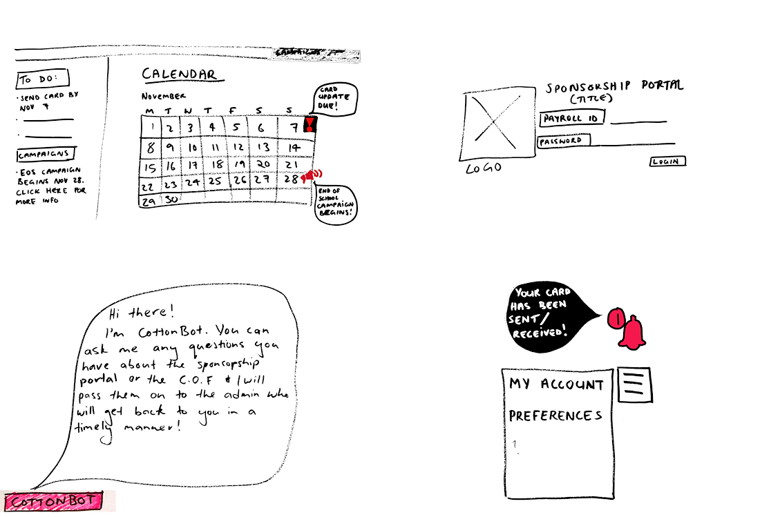
Initial Paper Sketches
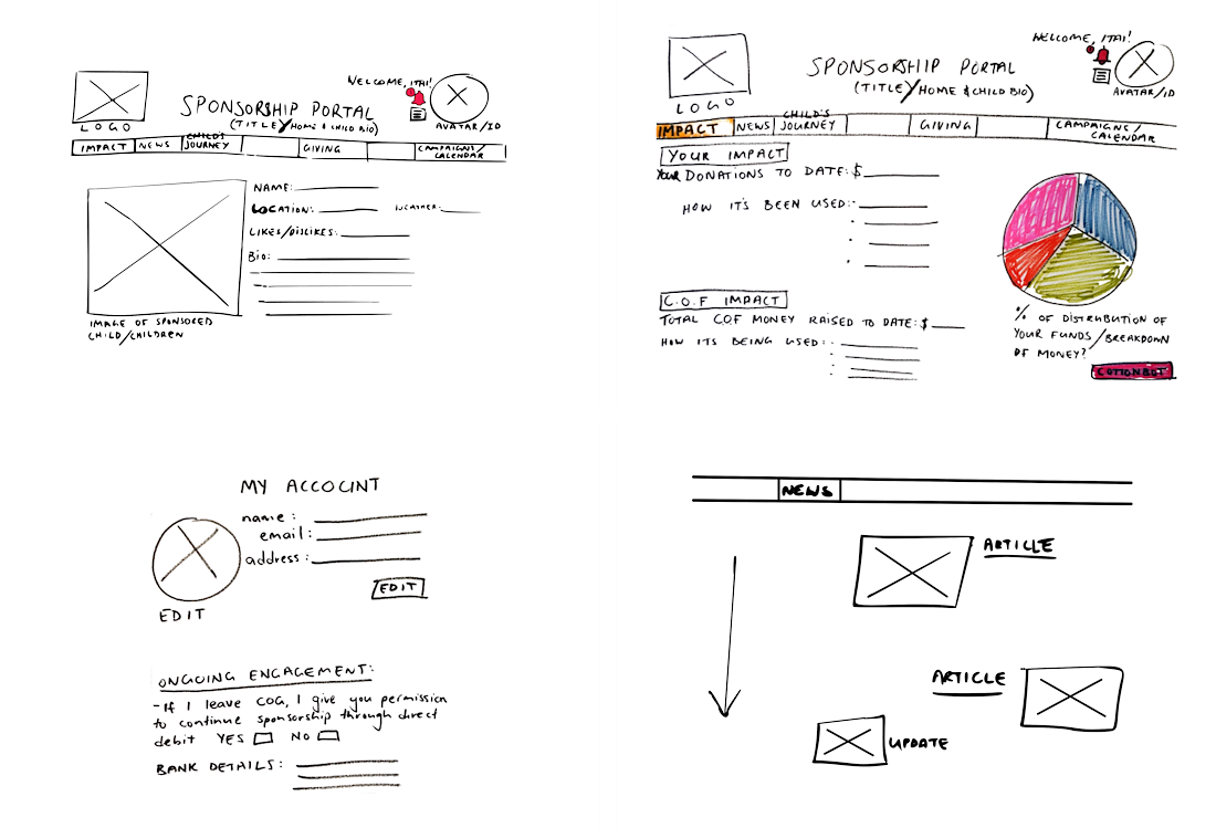
Initial Paper Sketches
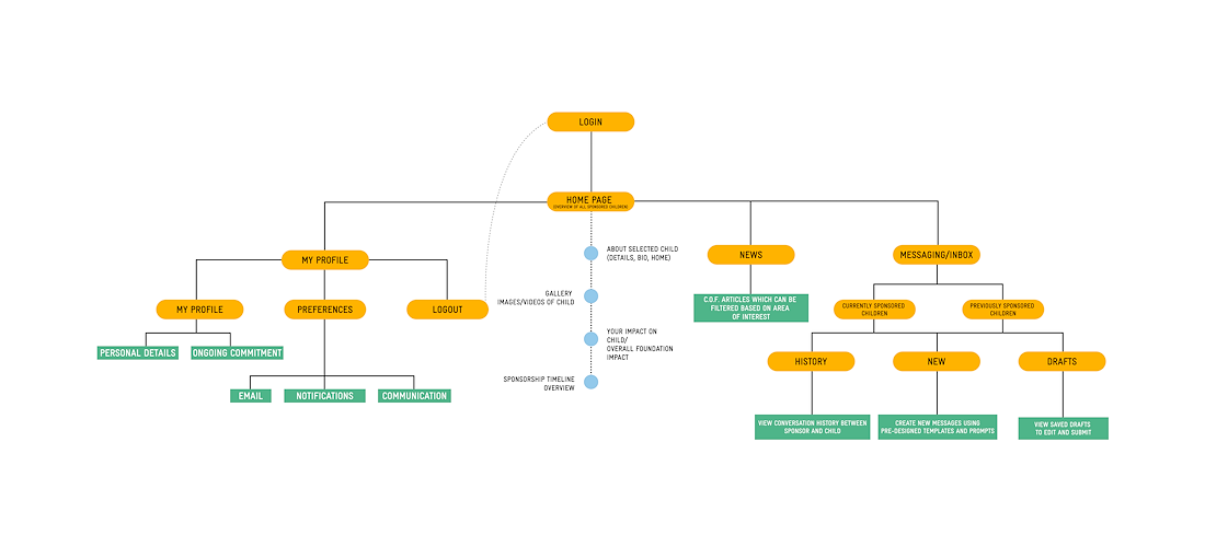
Sitemap Plan
user testing
Before presenting the product to the stakeholder, I did a round of user testing in order to reveal possible usability problems and further iterate ideas, whilst also adding higher fidelity to the design. Here are some of my findings:
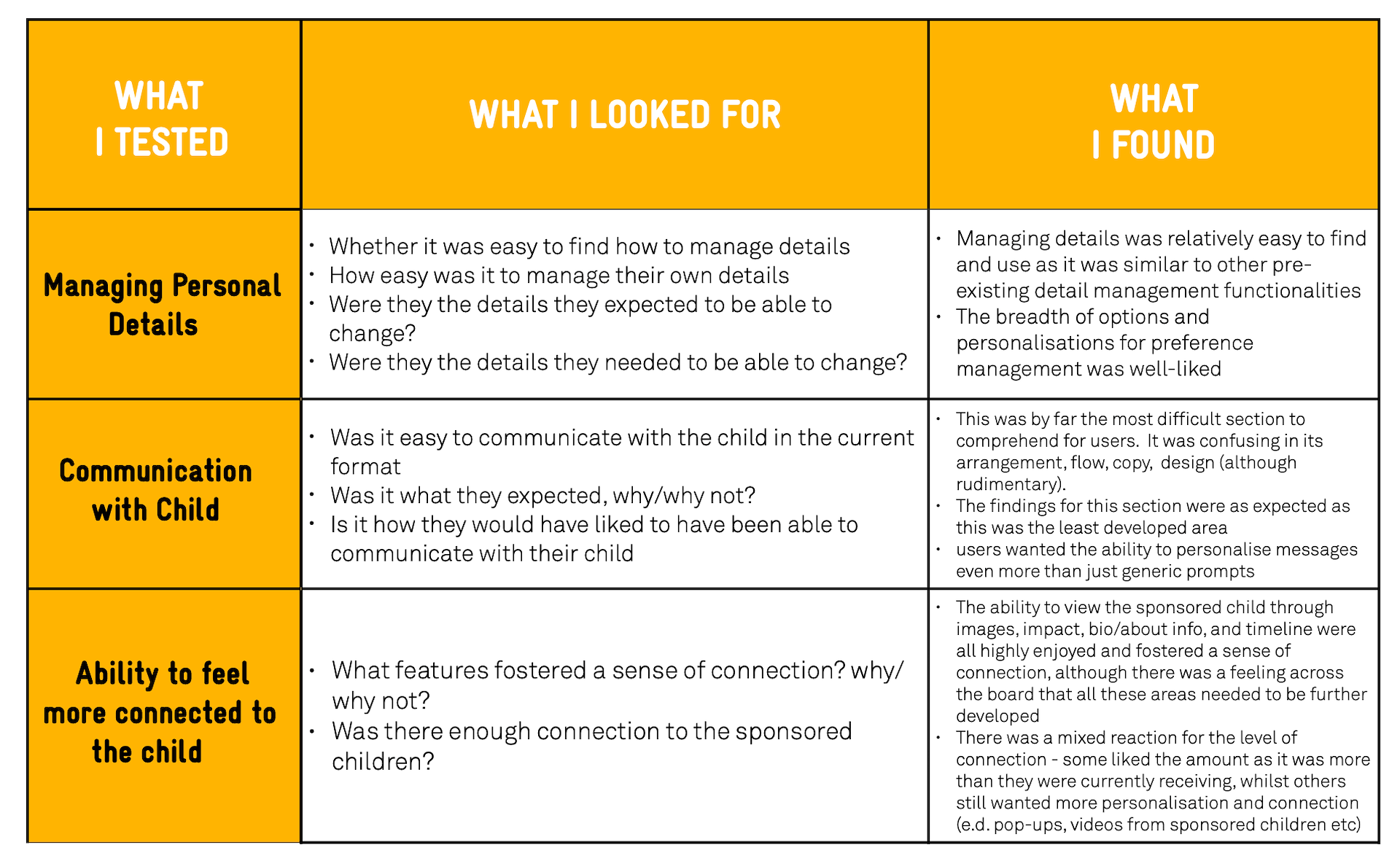
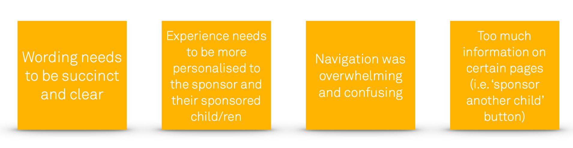
Main common findings
iteration
Once I tested out all usability mistakes, I started reiterating the final prototypes in Figma. As this platform was being built from scratch, I didn't follow any material guidelines other than the company's brand guidelines which allowed me to have greater creative control. Stylistically, I went for minimal text and functionality whilst still adhering to the needs of the client and users, however tried to achieve a playful atmosphere as this was important to the users – they did not want it to feel like it was a bland, corporate experience. It was designed solely for desktop as the user research outlined that sponsors would not lean towards a mobile application for their needs.
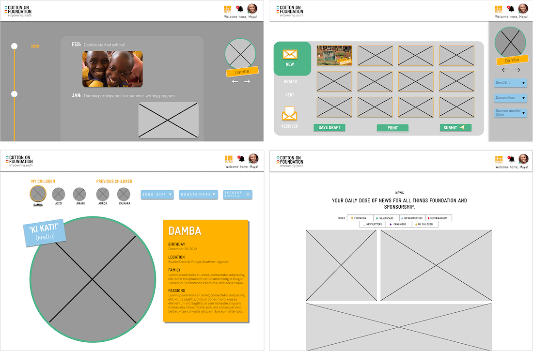
final design prototype
what next?
1. BUSINESS
2. PLATFORM
3. FURTHER RESEARCH


